Issue Mapping
Hello all! Here’s the process to my Issue Map over Obesity in the U.S.
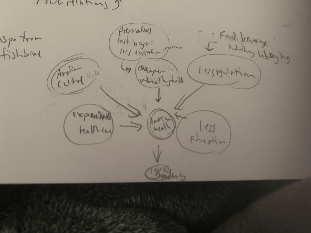
First, I sketched out all of my ideas, cut from the image were my notes from the Issue Mapping reading. From what you can tell of my handwriting here, you don’t wanna read those.
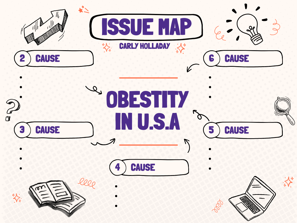
Then I picked a template! From Canva to be specific, I edited a mind map and turned it into my issue map! This isn’t the original template, but right when I was about to add the “causes.” Trust me, it looked a lot different from this.
I was actually originally going to the fishbone diagram, however felt it looked too sterile for my tastes. I like cute stars, swigglies, and sketch elements too much for my own good.
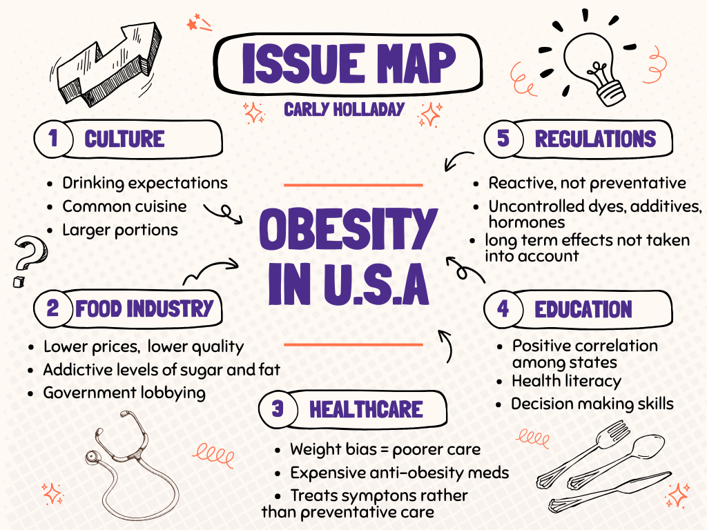
And here it is done!! Though it’s a little simple, I feel it’s a great starting point for my proposal.
See you next week!
2 responses to “Week 3”
-
Hey Carly,
I see you are a fellow fan of Canva templates. I thought about doing one of these, but I ultimately ended up doing a flow chart instead. I gotta say, I definitely prefer your map over mine…
This is primarily because yours is incredibly detailed, but not “sterile” as you put it. I really liked that you added some health and food themed decorations to the map as well.
Finally, you made super sharp observations about obesity. I liked that you pointed out the lack of “health literacy” especially since health classes seem to be undervalued in American culture (in my experience at least).
Awesome job as always.
~Dominic
LikeLike
-
Hi Carly,
I agree with Dominic that you made some great observations. one of my biggest frustrations with the American food culture is that we deal with the only affordable foods being the worst for you. I have been interested while watching what changes Tennessee is making to help food be more affordable. They removed a lot of junk food from SNAP benefits, while also pushing to stop taxes on fresh fruit and veggies, and yet I am worried that those prices still won’t balance out.
LikeLike

Leave a reply to deg4a Cancel reply